Casestudy #1
The Crossroads Anywhere App was created to inspire and equip users with a simple way to form a spiritual habit. This case study focuses on the Home Tab redesign. My main objective for this project was to redesign and redefine what users imagine the Home Tab can do.
-
Through research, I discovered that users found it difficult to find custom content like articles, podcasts, volunteering events, etc.
The Crossroads Leadership Team found the app lacked luster and felt it didn't have that “ Crossroads touch”. It had grown bland, lacking the spark of inspiration the internal stakeholders craved.
Crossroads is a church that champions adventure and fun. The church sinks in a lot of resources for this app. So, balancing user needs with internal stakeholder desires was something I had to balance in this project.
-
We would need to upgrade things on the back end. Things like that are tricky to pitch to the clients because they don’t physically see the results like we do with our more visual pitches.
The other tricky half of this pitch was the amount of time it would take the development team and me to build and test this. It was the largest batch of work that we had presented to leadership to date.
-
I wanted the home tab to reflect precisely what users and stakeholders were asking for. They want a product that gives users a unique and customized journey while giving them a strong sense of who Crossroads is and the feeling of faith through the community.
I also wanted the app to reflect more of who Crossroads is. I wanted the app to feel more adventurous.
-
My role: I served as the Lead Product Designer for this project, working with a team of developers and one product manager.
Timeline: For this project, I worked in an three different 8-week product cycles. The first four weeks were spent gathering research, user mapping, and wire-framing flows. Then, I transitioned to Figma, where I spent the next three weeks working on UI design visuals and refining designs with the client. After that, I presented, and the following weeks/months were spent handing off files to the development team.
Programs Used: Figma & Excalidraw
Redesigning the Home Tab for The Crossroads Anywhere App.
2 Differential people (including myself) | 7 Crossroads Stakeholders | Duration 3 hrs
First, I hosted a product strategy workshop with key stakeholders at Crossroads.
Important Takeaways:
We need alignment with the new Crossroads branding and the “Feeling of adventure” that Crossroads centers itself around.
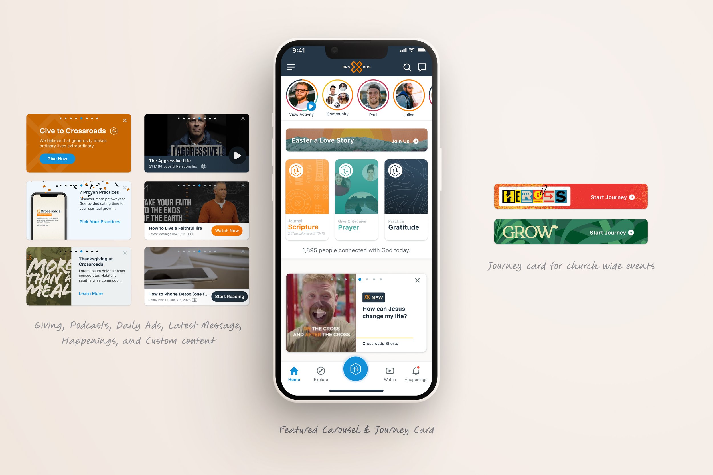
Important churchwide announcements should be surfaced on The Home Tab to reach a wider audience.
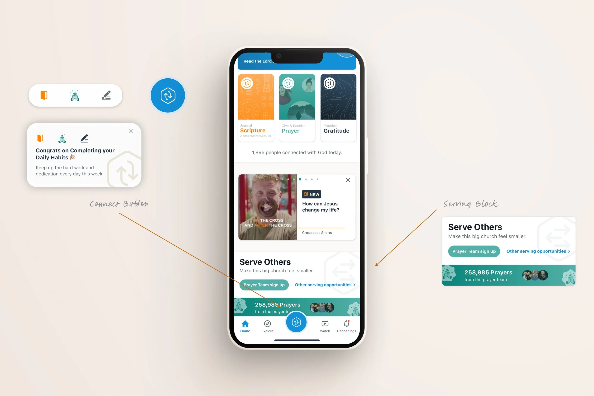
Sign-up for events and all serving opportunities need to be easy and a 1:1 of the web. No more kicking users to the web version to sign up for events.
We want more Crossroads users to use the app, but only 25% of church attendees have done so to date.
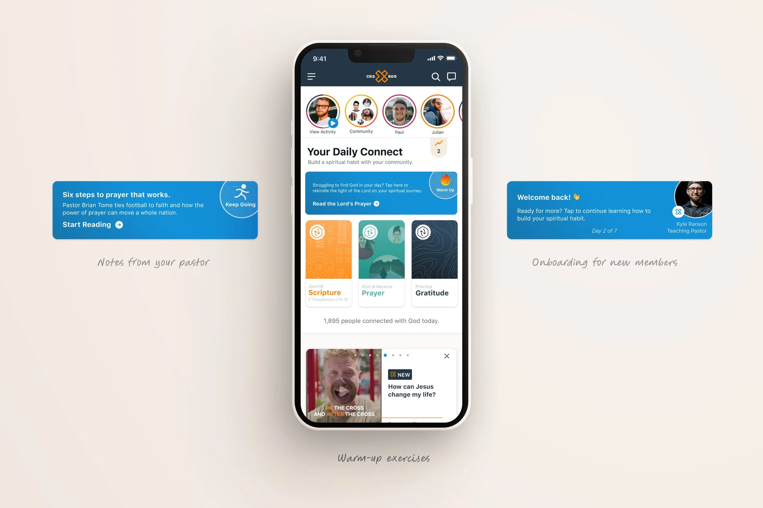
I want to start including warmups for users who need a little more content before diving into the day's scripture and more guidance with their spiritual growth in general.
Then, I gathered a group of regular Crossroads users and hosted an hour long virtual focus group on the current Home Tab.
workshop lead (me) | 11Crossroads Superusers | Duration 1.5 hrs
Results from this focus directly from our users:
Users love the aspects of connection and community in the app and want to feel more of it.
They find it difficult to browse or find an event or serving opportunity at the church that they want to sign up for.
The current look and feel don’t inspire or excite them. It's “bland, mundane.” They agreed with stakeholders when we asked if it felt like it lacked the Crossroads look and feel.
Users want more from daily habits—options to go further than just they days content.
We want more personalization within the app. Users want to see the next podcast they regularly listen to or friend suggestions for people who attend their local Crossroads location. Right now, the app is a “one size, fits all” model, and our users want that to change.
“
I wish the app had a more personalized approach. I love the content that is on here, But I have a hard time finding what is important to me. I find myself having to write down important dates, times, or things I find interesting so I can go find them again.”
Crossroads User
Results From Research
After hosting my user focus group and product strategy workshop. I then went to alternative sources of user research we had at our disposal. For this I used data that we had gathered in Amplitude over the past couple of cycles. And user surveys that come directly from the app.
This is something I like to implement before any groundwork on designing begins. Gathering data on what your designing is critical to ensure you’re solving the right problems.
Insight 1 - Branding
Content is repetitive and mundane on the Home Tab. They want this app to feel exciting and have more of a Crossroads look and feel to it. Users don’t like the Khakhi.
Insight 2 - Custom Content
Users and Crossroads executives all want to see personalized content on their home tab. They want to see what podcast is next up for them instead of searching for it. Finding content is hard.
Insight 3 - More things to do
Focus on a balance of church updates and spiritual fitness. Right now, it’s weighted more heavily toward spiritual fitness. How can they personally contribute to the community and church? This should be a tool for both users and Crossroads staff.
HMW…
Make the app feel like it's more part of the Crossroads brand?
HMW…
Surface personalized and relavant content so that the Home Tab feels like a customized experience for each person?
HMW…
Give an equal balance of church-wide updates and community along with forming a daily spiritual habit.
The next step was to audit what was already there.
First, I conducted a full audit of the current Home Tab.
The scale of the prayer bar is wonky. Too Small.
Want alignment with overall branding and website.
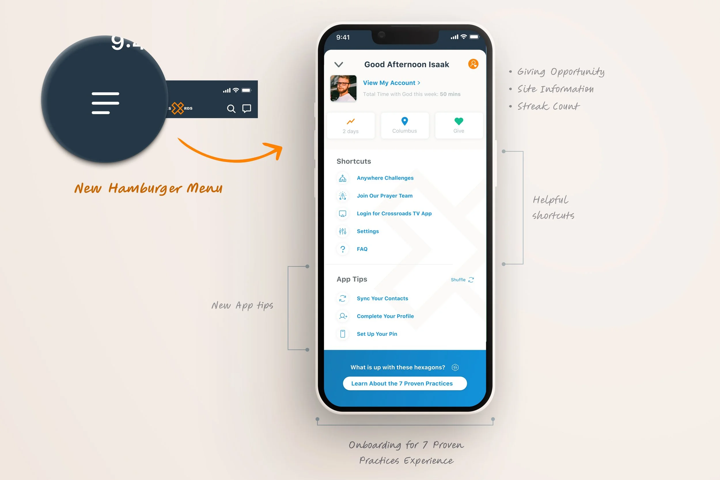
Streak information isn’t helpful. No actual information is displayed.
Daily habits take up so much space and don’t really benefit the user. This space can be used better.
Next, I looked at our competitor, Youversion. They thrive in spiritual growth and posting a daily habit.
Great retention of users and daily habits.
Unification with their mobile app and website.
Ways to get in touch with resources nearby or online.
Overall, branding is aesthetically pleasing—great Ux decisions.
“
I wish the app had a more personalized approach. I love the content that is on here, But I have a hard time finding what is important to me. I find myself having to write down important dates, times, or things I find interesting so I can go find them again.”
Crossroads User
Primary User Persona
Mark Clarkson
Mark is a dedicated family man in his early 50s whose life centers around his faith, loved ones, and providing for his family. With a warm smile and a heart full of love, John embodies the values of commitment and community.
Every Sunday morning, you can find Mark at his local Crossroads service, where he eagerly participates in worship and fellowship. He cherishes the sense of belonging and connection he feels within the church community. Despite not being particularly tech-savvy, John navigates his iPhone with ease, using it to stay connected to his faith through the church's app. However, John struggles to find personalized content in the app. Whether he's listening to sermons on the go or engaging with virtual small groups, John finds solace and inspiration in the digital extensions of his church family.
-
Age: 42 years old
Occupation: Sales Operations Manager
Status: Married
Location: Denver, Colorado
-
Steady
Kind
Passionate
Inveted in faith
Family Driven
-
A sense of connection to his in-person community through digital extensions.
Personalized content made for him. Easy to find this information. He's too busy for lengthy app navigation.
Things for his whole family to enjoy.
-
Mark typically arrives early to campus to share his daily habit responses with his small group before services. He is tightly synced up with the community.
Mark and his small group often share church and bible-related content they find in the app in their group chat. (Navigating away from the crossroads app)
He always writes down the last podcast he listened to so he can quickly jump back in.
He writes down important church announcements he hears at services in his planner.
He often asks church officials how he and different family members (of all ages) can connect at the church.
He is a creature of habit and finds himself navigating to other apps for additional content because of the lengthy navigation required in the Crossroads App.
The creation of Mark, led to a user journey to understand what type of workarounds users come up with to find relevant content and creative community. This customer journey map helped us understand the user’s motivation to share through specific mediums and validated our initial assumption that users were l likely to use the app when the initial home tab was so limited and uninspiring.
The results from the customer journey map, research, and surveys were used to inform us on how we can effectively incorporate customized elements into the home tab, what encourages users to share more content, and how we can increase the sense of community within the app?
The biggest pain points discovered during the research stage were that the participants were annoyed with the lack of fresh content and feeling of a true digital congregation, as well as not being aware of how they could personally contribute to the church. We want to keep the users in the app and not navigate away to competitors to complete the other tasks.
Information Architecture Stage
Excalidraw is a program where I start thinking low-fidelity and begin sketching. From there, I typically transition to Figma, using it as my go-to platform for creating high-fidelity designs and prototypes. It's a fluid workflow that allows me to capture ideas effectively while transitioning smoothly between tools.
Breadboarding
At the initial stages of my design process, I breadboard. This allows me to lay the groundwork by establishing a clear hierarchy and defining essential elements required on the page.
Lo-Fi Sketching
From there, I took the breadboard and started sketching my new desired sections. For this home tab redesign, I wanted to keep the original goals that stakeholders mentioned early on while also considering the users' needs and requests.
Every project, especially one as significant as this, requires thoughtful iteration. From the first lo-fi sketches to the polished final product, weeks of refining and ideating ensured that the solution not only met user needs but also aligned with stakeholder goals. Throughout this process, I continually revisited ideas, tested different approaches, and fine-tuned the experience to create something that felt right for both the users and the business. It's a balance of creativity, feedback, and strategy—ensuring that every design decision delivers value.
The Solution
Gone are the days of a static and monotonous home screen. With the new refresh, we have introduced a dynamic and captivating environment that sparks intrigue from the moment users launch the app. By incorporating user-centric design principles, we have made every interaction an opportunity for discovery, ensuring that each individual's experience is uniquely tailored to their preferences and needs.
Committed to delivering a personalized experience shines through in the revamped home tab. Users can now expect a delightful blend of curated content, relevant recommendations, and intuitive navigation, all seamlessly integrated into a visually stunning interface.
Whether it's discovering thought-provoking articles, exploring engaging videos, or connecting with like-minded individuals, the Home Tab Refresh empowers users to forge their own path and navigate the Crossroads Anywhere App in a way that resonates with them personally.
Learnings and Findings
The new design resulted in a positive response from our user base (🥳). With a wider audience, drawing in more users than even our typically busy Holly Week. In addition, we saw a massive increase in daily habit activity and content creation from users across the board, which is seen as a big win!
26.9%
Increase in complete Daily Habits
28.3%
User Content Created
54%
Completed Daily Habits in a week
37.5%
Spike in new user app downloads
23%
In users Sharing Content
12.5%
Service Sign up
Want to see more?
These mock-ups can only do so much.
Download the Crossroads Anywhere App for the full experience and up-to-date designs.


